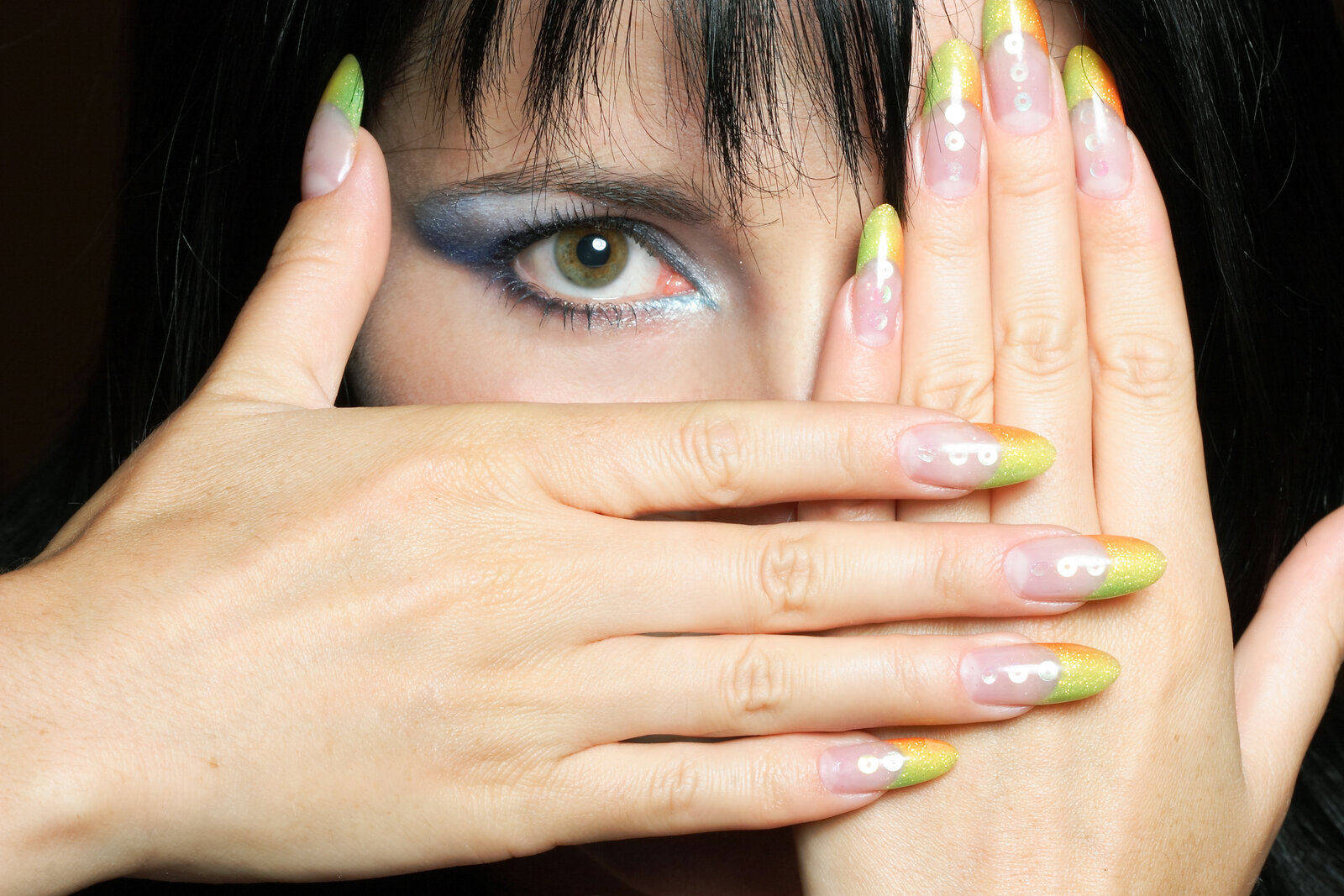
A few years back, a student in one of my live workshops sent me a portrait retouch that was technically flawless. Smooth skin, clean background, sharp eyes. And it looked completely dead. Flat. Like a wax figure. She had fixed every “problem” but removed all the dimension in the process. The light that made the photo interesting in the first place was gone.
That’s the trap most people fall into when they retouch. They remove. They smooth. They clone out shadows because shadows look like flaws. But shadows and highlights aren’t flaws. They’re the thing. They’re how your eye reads a three-dimensional face on a two-dimensional screen. Dodge and burn is how you give that back.
What Dodge and Burn Actually Does to Your Pixels
Dodge lightens. Burn darkens. You probably knew that. But here’s the part that matters: when you use Photoshop’s Dodge and Burn tools directly on a pixel layer, you’re permanently altering the luminosity values of those pixels. That’s destructive editing, and it gives you no room to course-correct.
The smarter approach, the one I use on every retouch, is to work on a dedicated gray layer. Create a new layer, fill it with 50% gray (Edit > Fill > 50% Gray), and set the blend mode to Soft Light. Now when you paint white on this layer, it lightens the image. Paint black, it darkens. Everything stays non-destructive. Your original pixels are untouched. You can lower the layer opacity, mask sections, or throw the whole thing away and start over without losing a single thing.
Soft Light mode is the key here. It ignores the midpoint gray (128, 128, 128) and only applies the effect as you push toward white or black. That’s what makes it feel like real light rather than a cheap brightness boost.
The Brush Settings That Actually Matter
Most people open a big soft brush and start painting broad strokes. That’s how you get blotchy, fake-looking results. The settings I come back to on almost every job: a soft round brush, 10-15% opacity, 10-15% flow. Low opacity, low flow. You build the effect slowly. You’re not slapping lightness on. You’re accumulating it, pass by pass, the way a photographer would plan multiple exposures.
For skin, I keep my brush size fairly small, somewhere between 50 and 150 pixels depending on the image resolution. I’m following the existing light. I’m not inventing new light. I’m asking: where does the light already want to be stronger? Where does the shadow already want to deepen? Then I reinforce that.
One more thing: use two separate gray layers. One for dodging, one for burning. Label them. This lets you adjust each independently. If your burns are too aggressive, drop that layer to 70% opacity. Simple.
Where to Apply It on a Portrait
I’ll walk you through where I actually paint. On the highlights layer (set to Soft Light), I use white to hit the forehead, the top of the nose bridge, the cheekbones, the cupid’s bow, and the chin. Anywhere the key light would naturally land on a three-dimensional face. On the shadows layer, I use black to deepen the sides of the nose, the hollows under the cheekbones, the eye sockets, and the edge of the jaw.
This isn’t creative invention. It’s observation. Look at the photo. The light already tells you where to go. Your job is to make the story it’s already telling a little clearer.
For the eyes, I bump up the catchlights and the whites with a tiny brush, around 20-30 pixels. I also darken the iris ring slightly around the edge. It takes thirty seconds and makes the eyes pop without touching a single “enhance eyes” preset slider.
The Counter-Argument I Couldn’t Shake
I got into a friendly argument with a student a while back about whether dodge and burn or curves adjustments is the better tool for this kind of work. It stretched across three tutorial videos before we landed somewhere useful. His point was that curves gives you more precise tonal control. He wasn’t wrong. Curves lets you target exact luminosity ranges with surgical accuracy.
But curves doesn’t follow your brush. Curves affects a zone of tone across the entire image unless you mask it carefully. Dodge and burn lets you paint exactly where the effect goes, pixel by pixel, following the contours of a face or the edge of a product shot. For retouching work specifically, where you need spatial precision, a gray layer beats a curves adjustment every single time. Use curves for global tonal correction. Use dodge and burn for shaping.
I still use a 2015 Wacom tablet for this work, by the way. Pressure sensitivity changes everything here. The harder you press, the more the effect builds. It makes the whole process feel like sketching with light rather than clicking through menus.
The One Habit That Separates Good Retouchers from Great Ones
Toggle your gray layer off and on constantly while you work. Every few minutes. The before-and-after check keeps you honest. It’s easy to go too far when you’re zoomed in at 100% focused on one cheekbone. Zoom out to 50%, toggle the layer, and see whether the effect reads as natural light or as obvious editing.
The goal is never a visible dodge and burn. The goal is a photo that looks like it was lit better.
Comments
Leave a Comment