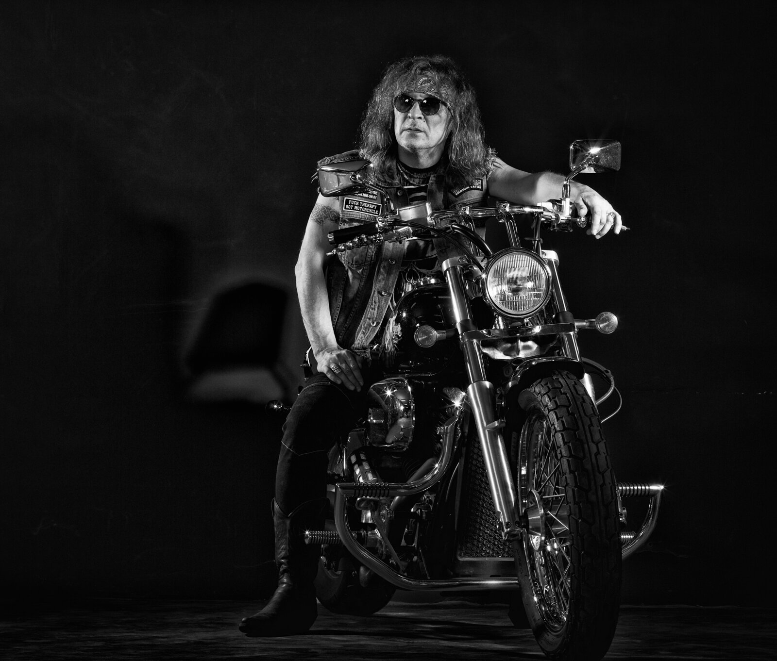
The first composite I ever spent serious time on took me 40 hours. Forty. I was trying to place a model into an industrial rooftop scene, and every time I thought it looked right, something was off. The shadows leaned the wrong direction. The skin looked like it was lit by a different sun than the concrete behind it. I kept adding adjustment layers like I was throwing darts in the dark.
That composite eventually got me my first agency job, so I’m not complaining. But I learned something during those 40 hours that no tutorial I’d found had actually spelled out: compositing fails at the physics level before it fails at the execution level. You’re not just cutting and pasting. You’re constructing a lie that has to obey the rules of light.
The Real Reason Your Subject Looks Pasted In
Most compositing problems come down to one thing: the light hitting your subject doesn’t match the light in your background plate. This sounds obvious, but the failure point is usually subtle. It’s not that the shadows are going the wrong direction entirely. It’s that the color temperature of your background is 5500K and your studio shot was lit with strobes at 6200K. It’s that your background has a strong bounce light coming from a warm concrete floor, and your subject has none of that.
Photoshop can’t fix a physics mismatch with a single adjustment layer. You have to diagnose it first, then correct it deliberately.
Here’s how I diagnose it: I use the Eyedropper tool set to a 5-by-5 pixel average, and I sample the brightest and darkest points in the background scene. I note those RGB values. Then I check the same tonal ranges on my subject. If the highlights on my subject are reading something like R:255 G:252 B:248 and the background highlights are R:255 G:245 B:220, that warm shift in the background isn’t on my subject at all. That’s the problem, written out in numbers.
Building Your Base Match With Curves
Before I touch anything else, I create a Curves adjustment layer clipped directly to the subject layer. I’m not going for a final look here. I’m going for a match.
Working channel by channel in Curves, I pull the highlights of the Red and Green channels up slightly and the Blue channel down in the highlights. How much depends on the gap I measured with the Eyedropper. A small shift might be just 3 to 5 points in the output value. A big mismatch might need 10 to 15. I keep the Info panel open the whole time and re-sample after each adjustment. The goal is to get my subject’s highlight and shadow values reading within about 5 RGB points of the background’s equivalent tones.
This one step closes about 60 percent of the color temperature problem.
Shadow and Edge Light Are Where the Illusion Lives
Once the color temperature is close, I build the shadow and edge lighting manually. This is non-negotiable. Every real scene has two or three light sources, even if it looks like one. There’s the key light, the ambient fill from the sky or walls, and usually a bounce from a surface below or nearby.
I create a new layer set to Multiply at 60 to 70 percent opacity and clip it to the subject. I paint with a soft brush using a color sampled from the darkest shadow area of the background, not black. Black shadows are almost never accurate. Then I create another layer set to Screen at 30 to 40 percent for the fill bounce, and I paint that only on the side of the subject facing the dominant background light source.
The brush I use for this is a soft round at about 200 to 300 pixels, with pressure-sensitive opacity enabled. I still use my 2015 Wacom tablet for this part specifically. Every time I’ve tried a newer one, the pressure curve feels different, and I end up fighting the tool instead of painting. If something works, I don’t touch it.
Matching Grain and Sharpness So the Layers Breathe Together
A clean studio subject dropped into a photo taken at ISO 1600 will always look wrong, even if your lighting is perfect. The background has grain structure and a slight softness from real-world optics. Your subject looks clinical by comparison.
I add a Camera Raw filter to the subject layer (converted to a Smart Object first) and add grain in the Effects panel. I match it by eye to the background, usually somewhere between 20 and 40 on the Amount slider with Roughness around 50. Then I add a very slight Lens Blur, usually 0.3 to 0.5 pixels in the Gaussian Blur filter, to knock off that clinical sharpness.
After that, I sample the background image noise with the Eyedropper across a midtone area and check whether it skews warm or cool. Analog grain from film or high-ISO digital shots is rarely neutral. I’ll add a tiny color shift in Camera Raw’s Calibration panel to match it.
The Fringe Problem and How to Kill It Fast
Edge fringing, that thin halo of the original background showing around a cutout, survives most selections. Even a good Refine Edge pass leaves it on high-contrast subjects. The fastest fix I’ve found is a Minimum filter (Filter, Other, Minimum) set to 1 pixel, applied directly to the layer mask. This contracts the mask edge just enough to eat the fringe without visibly shrinking the subject. For hair or fur, I skip this and use the Decontaminate Colors option in Select and Mask instead, with Strength set between 50 and 75 percent.
These are not creative steps. They’re technical corrections, and they need to happen before you start grading and stylizing. If you skip them and go straight to color grading, you’re building on a broken foundation.
A composite convinces the viewer’s eye because it obeys light, not because it looks polished. Get the physics right first, and everything else becomes easier.
Comments
Leave a Comment